
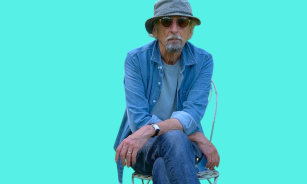
Blue Views – writes David Costa
David Costa
Edited by George Matlock
On the occasion of the 50th anniversary of Elton John’s first album for his Rocket Records label, graphic designer, art director and musician David Costa shares a vivid, colourful and graphical account of the emergence of the seminal artwork for Blue Moves
August, 1976. Our flight arrived very late into Newark but you could tell even at that time in the evening how hot the day had been. The advantage of the later flights is that you get through the airport quicker; we found ourselves ushered straight into the limousine to make the ride into the city without even catching breath. My first time in New York, bear in mind, barely able to take in the spectacle of Manhattan across the river becoming closer. We drove straight through the back entrance of Madison Square Garden, up the spiralling ramp backstage to join a queue of more long black shining limousines and even through the closed windows could hear, and feel, the crowd stamping along to Saturday Night’s Alright, the show’s encore.
It was Saturday night. And it was true, like everyone had told us before, that the entire line of parked limos was bouncing along in time on their soft, sumptuous suspensions, up and down on the ramp. As we were walking up to the backstage area, the crowd still roaring, Saturday ended, Elton came rushing offstage, grabbed us both and we all ran back to his limo, first one in line, and took off down the exit side of the ramp where a waiting escort of police bikes with flashing lights drew up alongside and ahead of us. My first time in New York, speeding through the streets of Manhattan at night, sitting in a limousine with Elton, and a police escort waving us through the red lights to the hotel uptown – at one point a car full of screaming fans came alongside; a police bike headed them off and pulled them over, disappearing way behind us.
I had no idea where our luggage had got to in all of this, but in it was a stiff envelope with a 10×8 transparency inside of a quiet, peaceful landscape with a group of young men lying in a summery English park, which is why I was there in the first place. Welcome to New York.
Why? Because
The sleeve for Blue Moves seemed an unpredictable image to wrap around Elton’s eleventh album, one short of a dozen in far less than a decade, which in itself is an output outstanding enough by any reckoning. The run of chart-topping albums which had already produced the classic songs that would continue to carry through his set lists for the next fifty years, also unleashed an astonishing touring schedule, one record-breaking success upon another. With the gifted Alan Aldridge, Elton and Bernie had created Captain Fantastic, patron superhero of rock and roll piano players, to chronicle the breathtaking odyssey; from ‘when I think of those East End lights…’ to ‘I used to know this old scarecrow…’ Like a comic book serial, this was the rounding up of Series One.
Series Two was about to emerge. It feels that Blue Moves evolved at a moment when it was simply time to take a deep breath, pause, and have a look around. ‘And just like us, you must have had a once-upon-a-time…’ I was relatively late to the party, just three years into the fold. Under Michael Ross’s wing at DJM Records I’d assisted him assembling Don’t Shoot Me, I’m Only The Piano Player, but within a year was to become the UK art director on Goodbye Yellow Brick Road, co-ordinating with Michael and David Larkham supplying the lyric illustrations from L.A., while Steve Brown and I directed and worked with Ian Beck on the jacket for front and back of the gatefold. Blue Moves was next in line. I’ve no recollection of why the album was called Blue Moves, nor can I remember where the idea of using Patrick Procktor’s painting came from; I suspect from Elton himself. He may even have asked Patrick for it.
The painting is called The Guardian Readers. In case you’re unaware, because you dwell in some far-off land, The Guardian newspaper had and still has the connotation of being somewhat erudite and left-field, middle-class leaning (left-field rather than overtly left-wing) despite its famous renaming by Private Eye in the early 1970s as The Grauniad because of its appalling sub-editing and blissful typo errors.
‘Oh, we’re Guardian readers’, people would say at North London dinner parties. This I can attest to. There was something about The Guardian that had a blue stocking air, you might say; intellectual, establishment possibly but never quite conservative, independent-thinking for sure.
I first saw the painting at Patrick Procktor’s studio in Marylebone, London, ‘a neighbourhood’ (as an obituary described) ‘he had graced with his hats and trailing scarves, velvet coats and carpet slippers for the last 40 years.’
Album promo poster, 1976
Patrick was nine feet tall, skinny and impossibly elegant with a constant cigarette languidly dangling somewhere. He was very much the last of the Bohemians, straight out of the Bloomsbury Group, but held in the same regard during the sixties as luminaries such as David Hockney, Bridget Riley and John Hoyland. The painting was beautiful, and painted in enamels. My impression of it propped up on the easel was one of quiet, of repose, nothing strident, nothing jarring. In the complete painting (the vinyl jacket is necessarily cropped) thirteen and a half guys are sitting, or lying, in a summery landscape bathed in pale blue light, heightened by the long band of deeper shadow cast by a single tree. Mostly the men are shirtless; they are gathered as if they all know each other but have dispersed into groups of two or three, three and a half of them on their own. Some are reading papers, others talking, their body language indicating animation and closeness. It is a scene of composure, friendship, simplicity.
One person sits apart and leans against the tree. Shadows, shoes, hair, socks, suit jackets and trousers are black or dark grey or brown, some fine brush or penwork picks out detail. Only one small piece of deep red cloth breaks the subdued palette, set low and nearly centred along the frame; it pulls your eye even further in.
This was simply not the stuff of arenas, sound checks, charter jets, interviews, photo calls, all the onstage and offstage and backstage noise and clamour that fills the days of yet another punishing touring schedule; none of such paraphernalia, just a painting of a group of friends lying in sunshine lying in either Hyde Park or Regent’s Park, as peaceful as cattle grazing. This was about the arrival of Elton, I could only suppose at the time, at another place altogether, and a more reflective, less frenetic place at that.
No labels, please
If you ever talked to Dick James (of the eponymous Dick James Music) about his views on album packaging, he’d invariably say, well, just stick it in a brown paper bag. But Elton’s choice, as I’m now sure it was, of Patrick Procktor’s painting was a very considered and intuitive one, and one that speaks of mutual resonance. It stands apart from any of the imagery that had gone before.
You can only deduce that some other mindset, on Elton’s part, was in play here. It hints at something more introspective and a move toward, if not newness, then the shedding of what had gone before – seven years producing ten albums and the pressure of commercial imperative, both onstage and in the studio. The race to this point had been run – and won – time and time again; if Blue Moves was seen as a kind of hiatus, it emerged as an album judged as coming closer to Elton on a personal level than any had done previously – among the tumult of global fame and success, a moment snatched, and a contemplative one. He’d announced in late 1976 that he was bisexual. I viewed him at that time as someone who wanted to shed any sense of category.
The stock-in-trade of the music business and music critics alike rises and falls on pigeon-holing. Category constrains and obliges. He was most likely done with both. In interview he had used the word ‘honest’; maybe so, but only up to the point that you have to make words rhyme, sometimes, and music work, always; honesty cut to fit the cloth, then.
Bernie’s lyrics on Blue Moves still spoke the Anglo-American language which had so successfully wedded both US and UK markets previously; Elton hadn’t dismissed the formula, but was moving on to a different space, musically, creatively, personally, choosing different collaborators and musicians. I do remember that Elton had a tendency to walk very fast, especially when shopping, so that walking with him meant having to half-run, half-skip awkwardly in his wake; with Blue Moves he had, not unusually, walked on ahead, leaving everyone else to catch up from somewhere behind in the time it took them to do so. He was simply moving on, and in some blueish fashion which right now I can’t readily put my finger on. I’d not formulated any such opinion at the time.
Artworking the double-album package became a sudden and urgent transatlantic affair, requiring me first to connect with photographer David Nutter in New York while Elton was completing a record-breaking ten-night run at Madison Square. He was king of Manhattan; the city was ablaze with him. All I had arrived with was the 10×8 transparency of the painting.
David had managed to squeeze in a session with Elton and the band, and he and I had to go through all his colour contacts and between us chinagraph our shortlist. The photos were at a marked contrast to the painting; few photographers could get that amount of animation out of Elton than the outrageous David Nutter, and the deep blue backgrounds and saturated colours of Elton and the band were more Californian Hockney than London Procktor.
I left New York to travel on to L.A. with the contacts and negatives (weirdly accompanying Bernie Taupin and Alice Cooper – I can’t imagine what we talked about throughout the flight) where the timescale for completion required me to take a desk at Jeff Adamoff’s studio at Universal City. There I’d assemble all the mechanicals for the double vinyl format, along with getting typesetting of lyrics and credits and legals together, undoubtedly with the help of Connie Hillman at the John Reid Enterprises offices in Beverly Hills, and then finalise and deliver artwork for distribution to all territories. The launch of Blue Moves in London, the kind of affair you’d struggle to call modest, was put together under press representative Caroline Boucher’s tasteful eye and held at the Auerbach Gallery in Mayfair’s Savile Row, a stone’s throw from The Beatles’ Apple headquarters. Blue Curacao cocktails were served, the painting (of which we had previously prepared a very high-end fine art limited litho edition) was on show and we hung Blue Moves flags outside the gallery. I still have one. With due circularity a recent Patrick Proctor retrospective in Paris in 2024 was entitled Blue Moves; the homage inverts. And fifty years pass. Elton, through the mystical alchemy and unstoppable talent he possesses, continued – continues – to become an even greater global celebrity, if that were even conceivable, with a further twenty-five albums at least, depending upon what you include, to his name.
Myself, I went on to art direct another eighteen album sleeves with him, including those with my studio Wherefore Art?, concluding with The Captain & The Kid in 2006, and including the box sets of Rare Masters and two versions of To Be Continued, one for the U.S and one for Europe, along with more tour or event books than I can actually remember – but probably beginning with the silver Louder Than Concorde tour book, and ending in 2013 (a nice, symmetrical forty years after I’d begun this particular journey) with the lavish book for his Million Dollar Piano series of shows at Caesar’s Palace in Las Vegas.
Blue Moves
Blue Moves, and beyond
I was always careful to illustrate and protect an image that was often fragile; Elton seldom enjoyed being photographed, despite his love of photography and the stunning collection he amassed. My resource for 1984’s Breaking Hearts, for example, was one polaroid by Richard Young; in and out of the studio in three minutes flat. That must be another record broken; got a sleeve out of it, though.
Aside from my choice of lettering – I should have used a small, minimal classic serif – Blue Moves remains an enduring image and a significant one, and the album itself I still listen to with great fondness; similarly, a significant one and to come full circle, an album I think that challenges categorisation. Of the many albums and packages we designed for Elton my favourite undoubtedly, is To Be Continued, the European version, with photography by a very young Juergen Teller catching a unique portrait I have still on my desk to this day; along with Sleeping With The Past, glorious photography by Herb Ritts, at a point where Elton has the look of somebody finally at one with himself; and The Captain & The Kid to mark the thirtieth anniversary of Captain Fantastic, where we merged two images by Ryan McGinley from separate sessions; one of Elton at the piano in his garden at Windsor, and one of Bernie on horseback at his ranch in California.
The photographs merged seamlessly, as if they were meant for each other; which of course they would have been. Why wouldn’t they? The image came together in minutes, and suddenly we found ourselves staring at the entire story of who each of them were, and had subsequently become, both as individuals and as that inseparable, inspired partnership; the blue-eyed boys of a unique musical generation.
Gallery:
David Costa
David Costa with Maisie
David Costa
Back cover
Front cover
Part 1 Side A
Part 2, Side B